One of the most challenging of literary ambitions is to carry an immensely successful, culturally iconic character from the early decades of the 20th century into an innovative and relevant re-imagining in the 21st. In Part 1 and Part 2 of this article, I looked at DC Comics’ 2010 effort to do exactly that with the character of Doc Savage. DC had launched a project called the “First Wave”, which essentially rebooted a number of notable 20th century characters into the present day. The first installments of the project, a Doc Savage/Batman team-up and a Doc/Batman/Spirit/Blackhawks/Avenger/Rima the Jungle Girl mashup, were not completely consistent in their vision, but did show elements of style and flashes of sophisticated storytelling. Production values were high, signaling what seemed a company commitment to quality for the project.
The next step after the introductory team-up stories, was to launch individual titles for the various characters. Since the greatest weakness of the first stories had been the inevitable discordance of mixing so many diverse characters in a single storyline, the individual titles, cleared of that impediment, were where I had hope for this concept to soar. Particularly with Doc Savage.
Instead of a more focused continuation of sophisticated 21st century art and story techniques, Doc Savage #1 came out of the gates as an epic fail. This look of stunned shock by Doc at the sight of a crash-and-burn in the initial multi-part storyline pretty much sums up my own reaction.
What happened? A very great deal went wrong. The comics medium is unique in that it has two distinct layers: writing and art. If both elements are brilliant, the stories produced can be stunning. If one of the two is strong, it can at least partly redeem a weaker effort from the other. But if both are weak…well, all hope is lost.
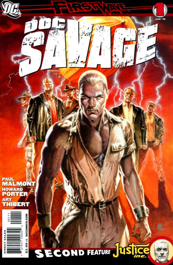
The cover image of Doc Savage #1, at least, had striking qualities. Done by J.G. Jones, it was a clear evocation of the James Bama style from the Bantam paperback series. Even that seemed to be a choice to look back rather than look forward, but it was still a dynamic image.
However, the opening page of the story itself brought an immediate crashing halt to the idea that an innovative, sophisticated tale was about to unfold.
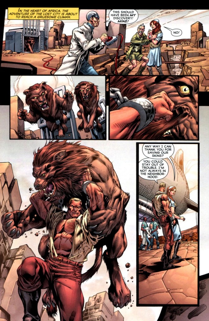
A nameless mad scientist releases lions on innocent bystanders…Doc Savage, his anatomy grotesquely exaggerated, is shown doing some lion-fighting, and the dialogue is entirely empty one-liners. Reading it, for a few seconds I thought Page 2 might show the modern Doc watching a cartoon of himself, perhaps chuckling a little at its crudity. But no…that was really the tone of the whole story to follow.
Brian Azzarelllo had been the author of the two previous First Wave stories, but here the authorship shifted to Paul Malmont. There was certainly reason for enthusiasm in the choice…Malmont had written a bestselling novel called The Chinatown Death Cloud Peril, which starred, of all protagonists, Doc Savage pulp author Lester Dent and Shadow author Walter Gibson in a pulp-style adventure.
In retrospect there were a few red flags coming out of the novel…despite its clever premise, the writing had an adolescent tone…but nevertheless it was entertaining and certainly displayed Malmont’s love of the pulps and knowledge of their history. In interviews he showed great enthusiasm at the prospect of writing an actual Doc Savage tale.
That it should emerge as flat and uninspiring as it did felt almost inexplicable. For the four issues written by Malmont, all of the more sophisticated style that had been teased by Azzarello was jettisoned. The story was a retread of concepts done better elsewhere (the “Lord of Lightning” theme had been done by Doug Moench 35 years earlier in the first issue of Marvel’s superior black and white magazine), the characterization was wooden, not just for Doc but for all the characters. They were given to a succession of empty one-liners just like that disastrous first page, and instead of taut plotting, the story was a succession of explosions and vapid action scenes. The Empire State Building has its top sheared off (in somewhat questionable taste within a decade of the World Trade Center terrorist attacks), the Hidalgo Trading Company is reduced to rubble…when the plot bogged down, it became predictable that something would explode in order to prop up the action. Though it was an alternative “real world”, Malmont seemed to lose track at times of common sense — after the Empire State takes its pounding, Doc comments to Renny that the engineer had built the structure well for it to have survived at all — seemingly forgetting that the building had been erected 80 years previously, which would have made Renny over 100 years old in a reboot setting of 2010.
The art, by Howard Porter, remained distinctly cartoonish throughout. Even with the expected exaggerations of comic book storytelling, Porter had difficulty drawing the human body, and his grasp of facial expression was limited. It felt as if all the ambition of the First Wave launch had been summarily abandoned.
Complicating matters further, each issue had a backup story featuring one of the other great pulp heroes of the Thirties, The Avenger. The tone of those stories was the polar opposite of the Doc Savage feature: in TV terms, if the Doc story felt like a Saturday morning cartoon, the Avenger story, with a dark artistic palette, realistic dialogue and unrelenting hardnosed approach, had the feel of a particularly gritty HBO crime drama.
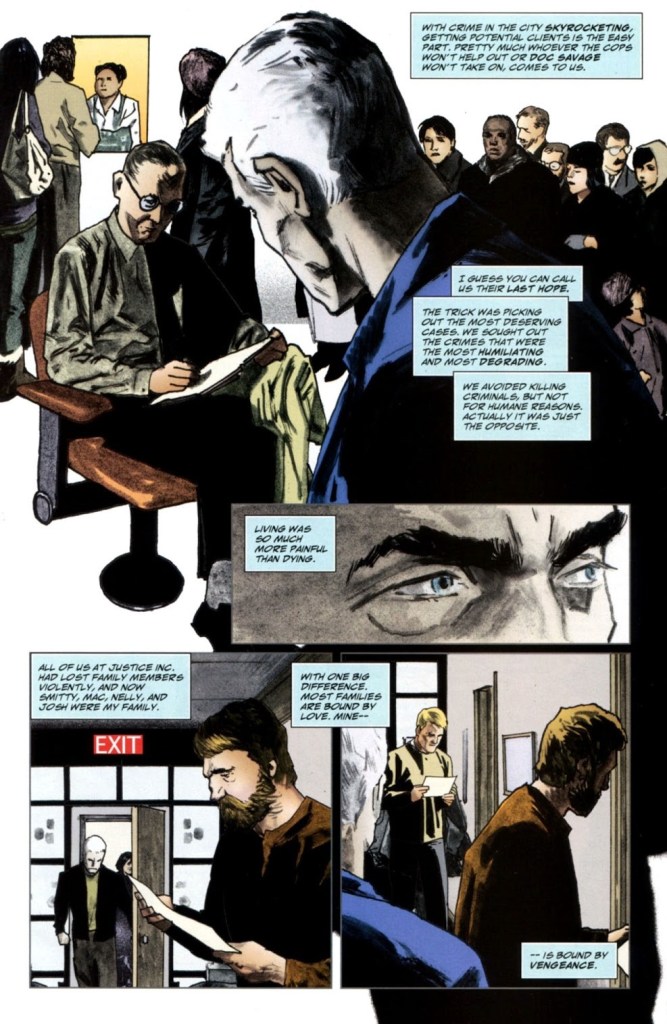
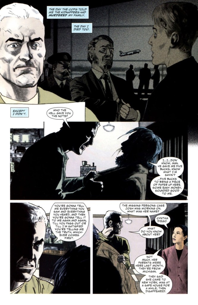
That choice of tone and style can be debated (and has been, hotly — the Avenger serial was enthusiastically lauded and profoundly hated by a variety of fans), but at least it was bold, and true to the premise of storytelling aimed at a more sophisticated audience. Appearing as it did along with the juvenile Doc feature, the two could not have been more ill-suited to be shown in the same book, even as separate stories.
This approach would continue for the next five issues, at which point there was a major change in the Doc feature. Brian Azzarello would return, and the art would have a major upgrade…kindling hope again that something of substance could come of Doc Savage set in the 21st century.
to be continued…

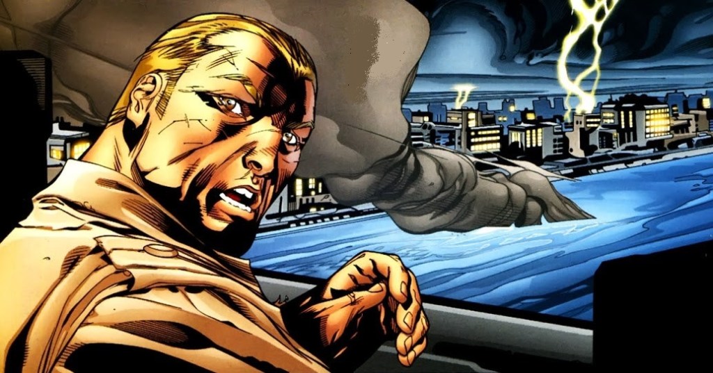
Nice analysis. I can’t help but be struck by the EMOTION the face-paralyzed Avenger shows here.
LikeLike
Thanks Jeff. Yes, even though the script of the Avenger story makes mention of Benson’s “frozen” emotionless features, the art does indeed display emotion. Though a tough concept to present visually (it works far better in prose only)…if you are going to use the original premise from the pulps, it’s important to commit to it.
LikeLike