Sometimes an artist will embrace a character with so much enthusiasm and brilliance that the two become forever linked. It seemed, at various points across the past fifty years, that such a bonding might happen between the dynamic, innovative creator Jim Steranko, and the iconic character Doc Savage. But it never really happened. Steranko, an author/artist auteur, never wrote or drew an actual Doc Savage story. Nevertheless, the flirtations were often spectacular.

Steranko (shown above in a self-portrait from 1970), first crossed paths with Doc Savage in 1972, on the cover of Issue #2 of Marvel’s comic book revival of the great pulp character.

For a then 14-year old fan like myself, it was quite a lightning bolt to see this on the comics spin rack. For an instant, I indulged in the feverish fantasy of the whole story within also being done by Steranko. But it was not to be. He was doing a fair amount of cover art for Marvel at the time, but no interiors. Still, the thrill would be repeated the very next issue, with a second cover.
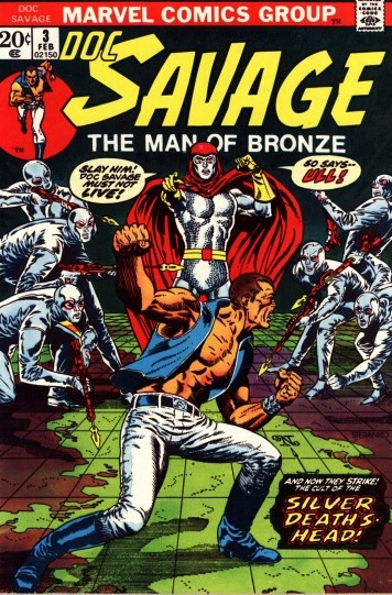
For a little while, that was it. No more Steranko covers were forthcoming in the series, which only ran for eight issues.
1972 saw Doc and Steranko again, however. He launched his media magazine Comixscene later that year, and chose to spotlight Doc Savage for the very first issue. The cover was a reprint of the Doc Savage #2 image, but the image here on a computer page does it little justice — Comixscene was a tabloid-sized publication, and the cover in print was big, and totally stunning. Likewise the image of Doc and his five aides below, which was the centerspread of the magazine. It was huge, and breathtaking. In addition, the spread had portraits of Doc by Gene Colan, Marie Severin, Dan Adkins and Mike Ploog. But the Steranko dominated the collage of images.


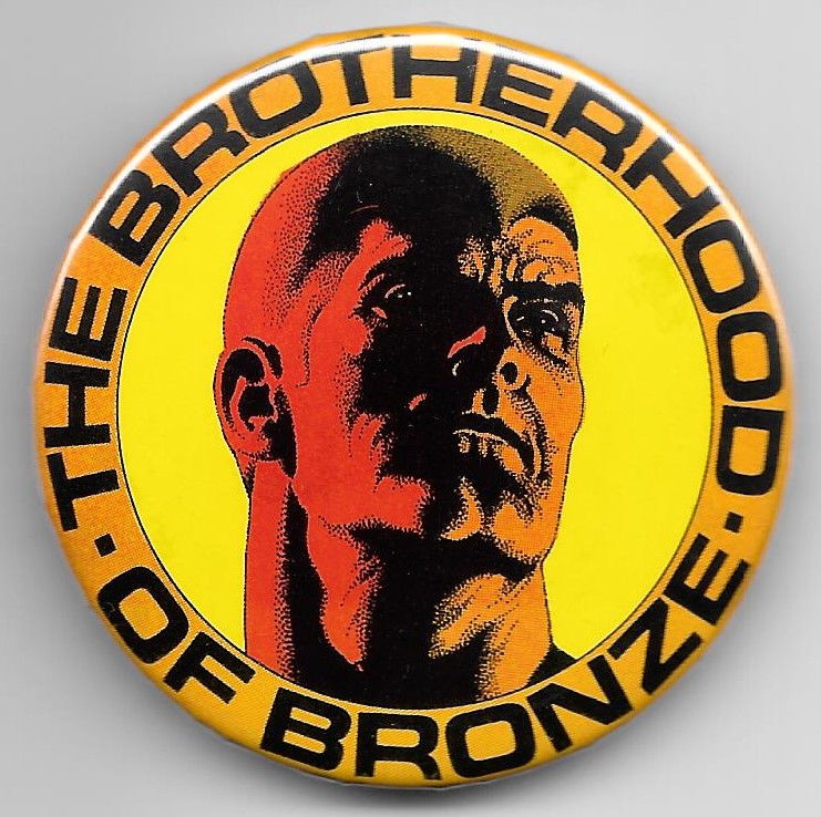
That was it for Steranko art in that issue…the rest of the visuals included some classic Paul Orban portraits of Doc and his aides, as well as some pulp cover reproductions. However, when the Doc Savage: The Man of Bronze film was released in 1975, there was a brief media flurry (until the movie tanked, and most of the interest in Doc as a multimedia character went away), which included Steranko creating the Doc Savage Brotherhood of Bronze club. I promptly joined the club, and the member package was filled with great items, including a bronze-tinted card with a Steranko Doc portrait, a pin, and a shipping envelope with some gorgeous art on it.


There would be no more Doc Savage connections for a long time, until Steranko did a cover for Argosy magazine in 1990, illustrating a Philip Wylie story reprinted there.

The image, though not for a Doc Savage story, clearly evokes the original first pulp cover by Walter Baumhofer, right down to the central figure holding a little Mayan artifact.

Steranko got a lot of mileage from that painting, called City of Bronze, as he used it as part of a trading card project and also a poster (which was marketed, not as a Wylie character, but Doc Savage). The trading card also had an interesting bit of accompanying text by Steranko: Philip Wylie’s novel The Savage Gentleman has been called the story that inspired the creation of Doc Savage. When Argosy Magazine reprinted it in 1990, I envisioned the protagonist holding a gold Aztec figurine, silhouetted against a bronze, deco city. He had a deep, almost metallic tan and hair like bronze shavings. I took a very different approach from Walt Baumhofer and Jim Bama, putting the hero in a tux! Your guess: Doc Savage, or not?
And then, there were the tributes. When Dynamite Comics did their version of Doc, they engaged Alex Ross for the covers, and two of them were direct homages to Steranko’s iconic Nick Fury, Agent of SHIELD covers.


Will there be more? Time will tell. Jim Steranko is alive and well at age 82, and one can only dream about the possibility that he could bring his brush to The Man of Bronze yet again.

That DS #3 was the only Marvel color issue I bought. I wish I’d bought more, because when I went out of my way to collect the B&W magazine, it was a huge let down in both writing and art. “Stinker” does not begin to describe it. The color series was really about the only art I liked from Andru. #3 was inked by Palmer, and adapted by Thomas, who was a DS fan.
LikeLike
I can’t be sure what “it” refers to in your comment. It appears to me that you are saying the B&W series was a huge letdown in story and art. If so, that is counter to virtually every opinion I’ve ever read. Many Doc Savage fans think the Marvel B&W magazine is the best graphic story and visualization of Doc and crew ever. I don’t recall anyone commenting that the color comic was better than the B&W magazine.
LikeLike
To Chris:
As I mentioned to Jeff, I’ve found fellow Doc Savage enthusiasts to have uniquely strong opinions about their likes and dislikes concerning Doc incarnations over the years. There was actually a pretty wide array of pencil artists on the black and white magazine, starting with John Buscema, then followed by Marie Severin, Tony DeZuniga, Val Mayerik, and Ernie Chan. However all (except Chan) were inked by DeZuniga, who gave the diverse artists a strong feel of continuity. I suspect if Jim Steranko actually had taken the reins for a full story, it would have been loved and hated too. But as the worst response to any creative endeavor is apathy, I always take the often fiercely-held opinions of Doc fans to be a testament to the power and appeal of the character.
LikeLike
To Jeff:
To my eye, Andru was not an inspired comics artist, more of a journeyman. But I’m glad you mentioned Palmer, Jeff — I never saw Andru’s art better than when it was inked by Tom Palmer, who also inked issue 4 and 5 of the color comic. It was a big drop-off artistically when Palmer no longer inked Andru for issues 6 and 7. Interesting that you disliked the black and white Marvel Doc Savage magazine — I enjoyed it very much. But it’s always fascinating to see how strong opinions are among Doc fandom, pro and con, for his various incarnations.
LikeLike
I am so enjoying these trip down memory lane! Thanks so much for this retrospective
LikeLike