
In Part 1 of this article, I took a look at some of the history of Doc Savage comics from Marvel in the 1970’s, which began in 1972 in the full color Doc Savage comic (which adapted original pulp novels in two-issue arcs), and then transitioned after the color comic’s cancellation into a black and white magazine version that coincided with the release of the 1975 Doc Savage: The Man of Bronze film.
The color comic had its highs and lows (the best to my mind being the adaptation of Death in Silver by Steve Englehart, Ross Andru and Tom Palmer), but with frequent author changes and the space restrictions of trying to squeeze a full novel into two comic book issues, it never quite hit a consistent stride of excellence. Basically, the eight issues of the comic run failed to fully embrace the profound difference between the world of Marvel Superheroes and that of classic pulp adventure.
By contrast, the 1975 black and white magazine came out of the gate with polish and confidence.
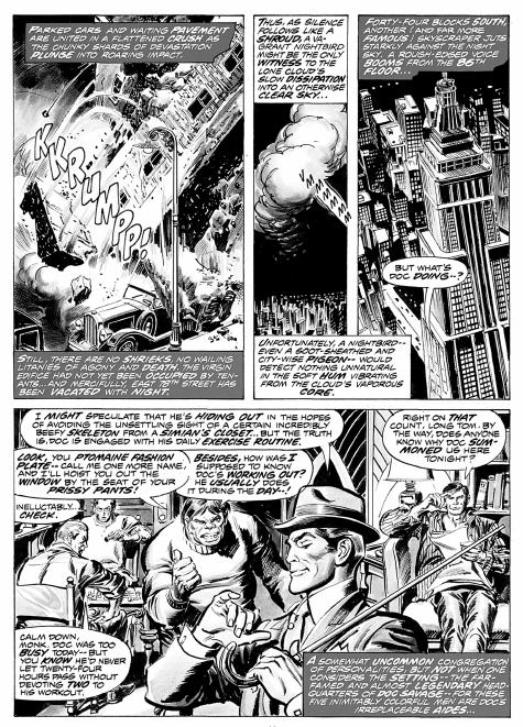
Instead of adaptations, the stories in the ’75 magazine were all originals. They could be structured and paced to put a single strong story into every issue. The first story in the series, written by Doug Moench, with art by John Buscema and Tony DeZuniga, tapped right into the zeitgeist of the 1930’s Doc with it’s explosive opening page.

By Page Two, we are introduced to Doc’s skyscraper headquarters, and inside, Doc’s five aides. Over the decades, comic portrayals of the aides have varied widely (which is always inexplicable to me, as they were described pretty clearly in the pulp novels). Here, they almost all fit the pulp descriptions. Monk has a burly gorilla-look, and Ham, to my eye, is done perfectly (many later comics would persistently and inexplicably give him a mustache, and his natty 1930’s attire would be poorly depicted with a garish lack of both fashion sense and dignity). Renny is big and has the “puritanical features” often described in the novels, though his hands are not quite the freakishly-large size of the books. Long Tom looks appropriately scrawny but with his tough-guy attitude as ample compensation for his size. Johnny is perhaps the one aide not visually compatible with the pulps — he is not remarkably tall and rail-thin — though his use of big words is right on the money.
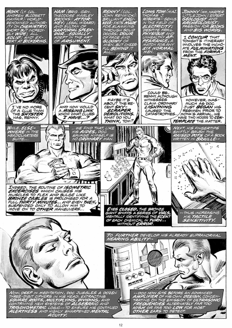
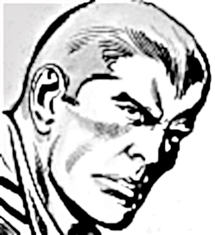
Doc is also introduced here, and in a subtle way (in the midst of his two-hour daily exercise routine). He is more Bama-inspired than styled after the Baumhofer pulp Doc…nor does he resemble the Ron Ely Doc from the film. Though the series will mostly see him in attire resembling that of the Bantam pulp covers, he will also sometimes appear in clothing suitable for the climate where the adventure takes place, and on occasion in a “normal” outfit suitable for the day.
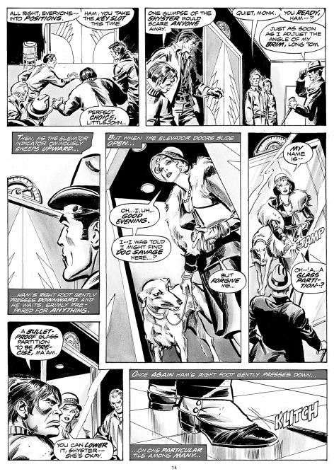
In the pages to follow, the scene deftly shifts between interplay between the aides, the arrival of the woman who heralds the adventure to come, and Doc exercising, while listening on the office intercom.


The story begins to unfold, and it has a very Lester Dent-like flavor, with danger and mystery intertwined.
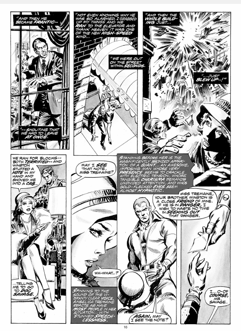
Doc appears, leaving Miss Tremaine somewhat speechless…and the action is about to kick into high gear!
to be continued…
